Save hours on social, every day.
Automate moderation and replies, schedule posts, and pull reports - all in one tool.
Today’s world is more intertwined than any era in history. The digital world increasingly connects people globally, and social media is a leader in information sharing. Users across platforms, especially those promoting their businesses, constantly seek the best and simplest ways to communicate their messages to the world.
So, how do you take a complex message and make it accessible to your company’s social media followers and the public?
That’s easy – by using data visualization.
What is data visualization?
Data visualization uses infographics to simplify a complex message and make it easy to understand. Popular data visualization firms include:
- Charts,
- Cartoons,
- Diagrams,
- Statistics,
- Images created with online graphic maker tools like PhotoADKing,
- Animations created with software such as Animation Desk or Animaker.
Graphic designers are often the masterminds behind the aesthetically pleasing and inspiring infographics shared across our timelines. Still, you don’t need a professional degree to use data visualization to grow your social media following.

Schedule content across platforms
Publish content across multiple social media profiles and networks with an all-in-one social media tool.
The benefits of data visualization
We are all living in the Information Age, with information on nearly any subject not only available but also threatening to overwhelm us at every turn.
Data visualization helps your company’s posts cut through the clutter, getting your message to your followers.
Data visualization can benefit your company in many different ways. It allows you to:
- Simplify complex messages for your audience. Data visualization can help you communicate a complex idea quickly to an audience that might not be well-versed in the subject by breaking it down into images, lists, or charts.
- Make an impact. A simple visual representation of your message will often go further towards impacting your audience. Consider the difference between seeing a pie chart with 99% shaded to represent “satisfied customers” and a line of text stating that 99% of your customers are satisfied.
- Provide accessible evidence to back up your claims. Visual representations of data inherently support your message by providing clear evidence without asking your audience to sift through pages of information to draw conclusions.
- Make your message aesthetically pleasing. Communicating your data with a visual makes a good impression. If it looks nice, people will notice and read it, and they will likely share it with others.
- Summarize all your data in one place. A quality infographic can neatly summarize a lot of information into a one-minute read.
How data visualization increases social media engagement
Incorporating data visualization into your social media content plan is a proven way to grow engagement. Here’s why infographics work particularly well:
- Visuals help people easily understand your message. In turn, if your followers know what you are saying, they are more likely to engage with your post by liking, commenting, or sharing it with others.
- People love to share infographics. The New York Times and Customer Insight Group and Latitude Research proved that people share posts that they find valuable and entertaining.
- Infographics help you retain relationships with your followers. Users do not want their newsfeeds overrun with boring text or unattractive imaging – that is a sure way to get your audience to hit the “unfollow” button.
- Infographics prompt your audience to read your post. An MIT study found that 90% of information transmitted to the brain is visual. Data visualization can help you tap into this and stop your audience from scrolling right by your posts.
- People are more likely to remember your infographics, which increases their likelihood of returning to your page. Studies show that people are more likely to remember your content if it includes visuals. Data visualization will help you tap into this, leading to more people remembering your company and returning to your page for more posts.
Data visualization ideas for social media
Now that you know why you should be using data visualization on your company’s social media profiles, it’s time for the practical part. Here are 6 different ways to make data visualization work for your social media presence:
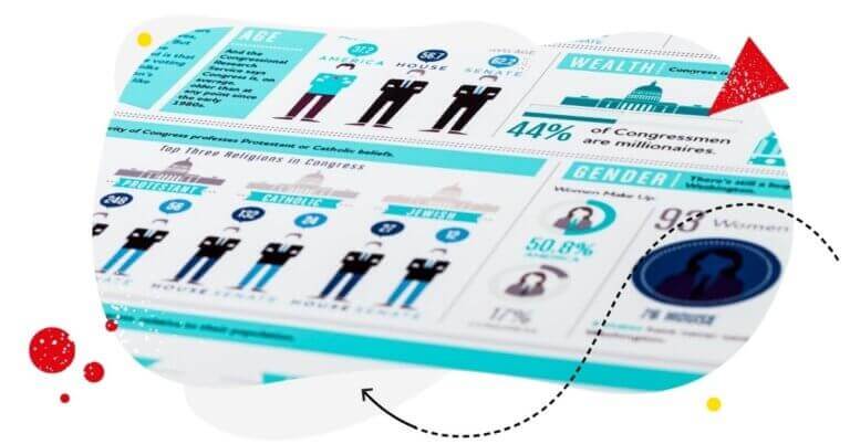
Illustrate a journey
This infographic is an excellent example of using visuals to take the audience on a journey through data. It presents numbers logically, beginning with broad concepts and narrowing down to the main message. In the end, you learn that the company offers services to help creators sell online courses, memberships, and downloads.
This infographic provides data of interest to the company’s target audience (creators), as they are the subject of the data itself.
This relevant information coupled with fun and unique visuals is highly likely to be shared and commented on by viewers on social media.
A long visual like this one works well on platforms like Pinterest, where users scroll to view the entire image. It will be challenging to use this on other platforms that follow strict image dimension restrictions, such as Instagram.
However, a quick fix for Instagram is to break the long visual into sections, posting it as a carousel of images instead of just one long infographic.
Use a numbered list to communicate ideas

Amazon created this infographic to inform that they were ranked #1 in LinkedIn’s top companies. They created a number list and used company logos to make the message comprehensible. Lists are easy to skim through while quickly scrolling and often contain just enough information for users to read in its entirety.
This example is short and best suited for platforms like Instagram and Facebook, where people look for quick bursts of information.
Numbered lists come in all dimensions, making them appropriate for all social media platforms. There are longer-listed infographics perfect for Pinterest. One good idea is to separate each point into a single Instagram or Facebook Story, with each tap bringing the viewer to the next numbered item on your list.

Measure your social media results
Get all key metrics in one view for each Facebook, Instagram, Twitter, LinkedIn, and YouTube, and save time by scheduling automated reports – with an all-in-one social media tool.
Share resources to highlight your company values
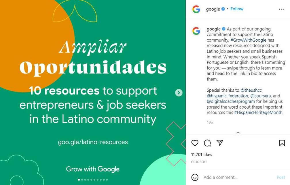
This Instagram post by Google uses a well-designed numbered list format to share resources for entrepreneurs in the Latino community.
They divided the information into slides for viewers to easily navigate every single resource.
Instagram users are likely to share such content with others who might find the resources valuable. Not only is it easy to read, but it also contributes to building a positive image of Google by highlighting its values and desire to help the community.
This format can easily translate to platforms like Facebook or LinkedIn. Post it on whichever platform’s audience will find the resources most relevant. In this case, LinkedIn members might be the most interested in resources related to job hunting.
Address frequently asked questions
Invisalign created this infographic to address customers’ frequently asked questions about their products – orthodontic retainers. This strategy allows them to bring in clients who may be hesitant about the product.
This data visualization style allows you to address your customers’ concerns before deterring a potential sale.
What’s more, this type of infographic is a great conversation starter for you and your new leads. Post it on Pinterest or redesign it to create a carousel of FAQs suitable for Instagram or Facebook. Then, boost the post with paid ads targeted at new users in a consideration phase about a product or solution you offer.
Use a summary to represent the impact of your company
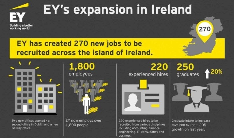
Ernst & Young designed this summary to show their positive impact on the job market in Ireland. This summary is simple to understand and concise enough to convey the gist of the message.
This type of infographic can help you develop a favorable public opinion of your brand. You can choose to summarize your value to a community in whichever way you feel will most resonate with your audience.
This infographic is ideal for a single post on nearly any social media platform: Facebook, LinkedIn, or Twitter.
Highlight statistics to prove value
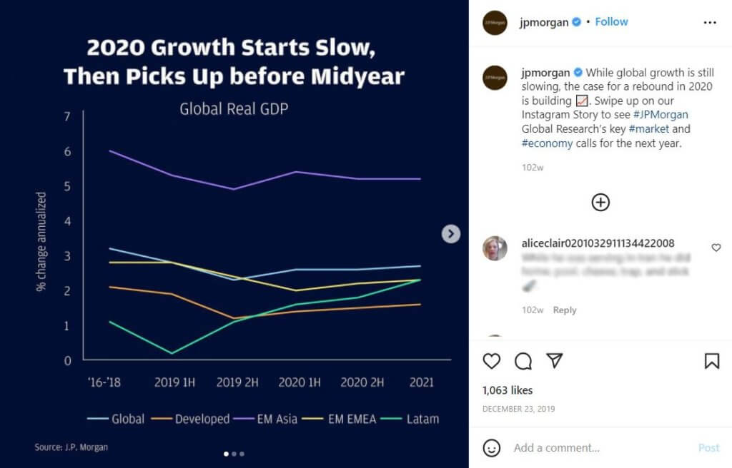
Charts work well for representing numbers and trends. As the attention span of social media users is quite limited, charts allow you to highlight data that would otherwise be overlooked on social channels.
Charts work particularly well for the business-oriented LinkedIn audience, but you can post them across different channels as well. Instagram, Pinterest, Facebook, and Twitter will work well.
Learn more about data visualization
Hopefully, this article helped you understand the importance of data visualization and incorporate it into your social media content plan. There are resources that can help you create your own infographics. You can start with checking these free Venngage templates and a list of infographic makers. Enjoy!